The colour of shade: how fabric tones shape the mood of outdoor spaces
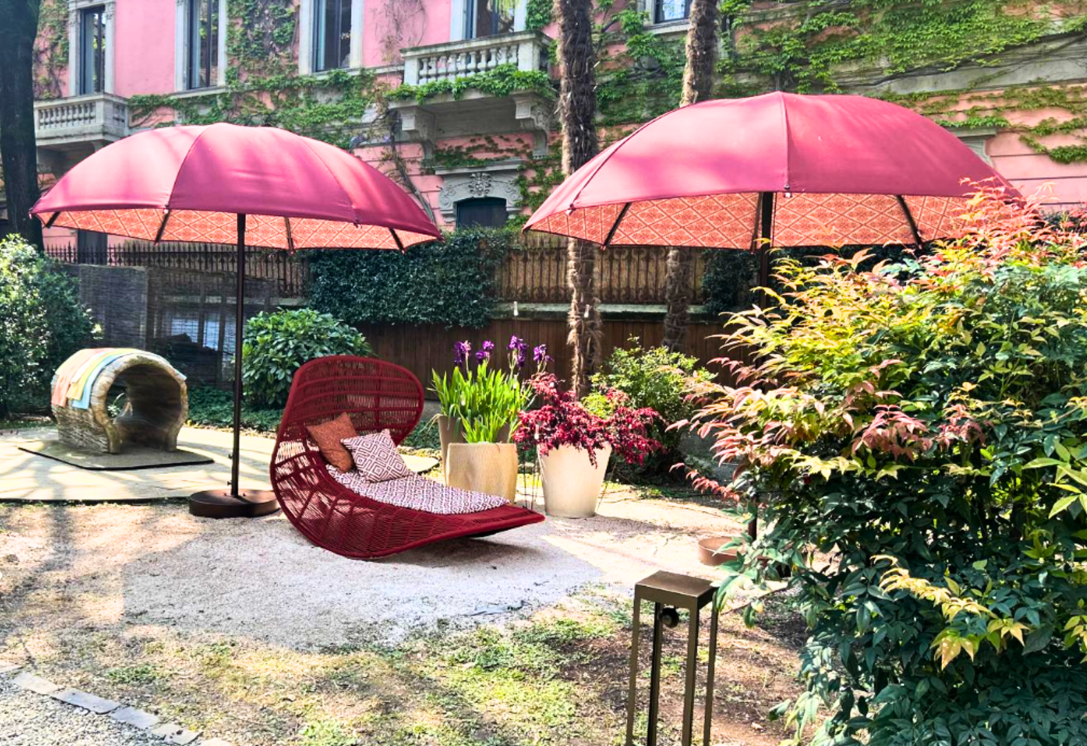
The colour psychology applied to outdoor spaces is based on a principle that is as simple as it is overlooked: sunlight does not disappear when it passes through a parasol fabric. On the contrary, it transforms and filters through the fibres, colouring the space below. The light created is “emotional”, capable of influencing the mood of those who sit within it. Choosing the colour of an outdoor fabric means, in fact, choosing the kind of experience that space will offer.
Shade is never neutral: fabric as an emotional filter
In interior design, the psychological effect of colour on walls, floors and finishes has been discussed for decades. Outdoors, this conversation has an unexpected protagonist: the parasol.
A parasol canopy is, technically, the covering of a micro-space. Perceptually, it is something far more powerful: the primary chromatic element perceived, consciously or not, by everyone seated beneath it, for the entire time they remain there. Those who sit in that space view the surrounding landscape through a light tinted by that colour. They breathe it in and internalise it.
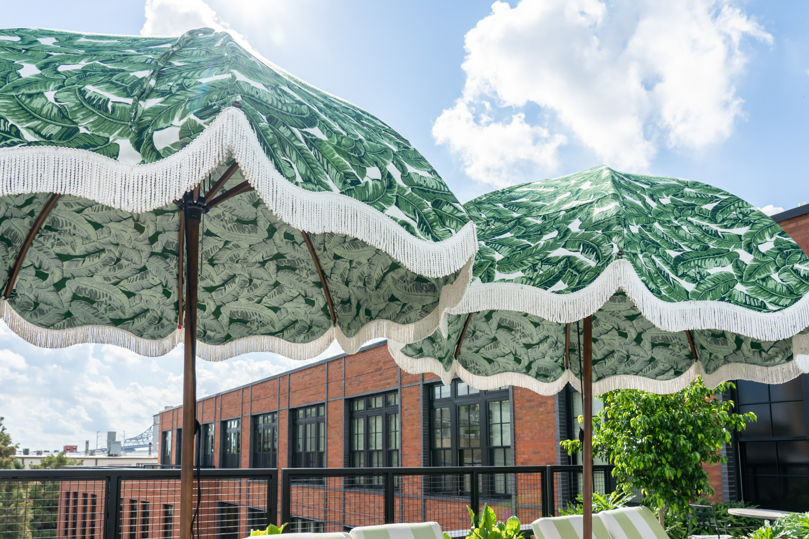
Textile surfaces positioned between sunlight and inhabited space are never neutral. They act as emotional filters: tempering or amplifying light, defining privacy and acting directly on mood. The same logic applies to any shade structure. The colour of the filtering surface shapes the atmosphere and creates a unique individual ambience. Its effect extends well beyond the purely visual.
The guiding principle for every design decision is this. Warm shade stimulates conviviality and social openness; cool shade encourages rest, regeneration and inward retreat. Understanding this distinction fundamentally changes how an outdoor space is conceived.
How fabric colour transforms light: the physics of chromatic atmosphere
Before exploring individual colour families, it is worth understanding the physical mechanism that makes all of this possible.
When sunlight strikes a fabric, three phenomena occur simultaneously: absorption, transmission and reflection. The fabric colour determines which of these prevails. A green fabric, for instance, will absorb red and yellow wavelengths, allowing predominantly green wavelengths to pass through. Those seated beneath it will perceive a cooler, more natural quality of light.
Fabric texture plays an equally decisive role in colour perception. Smooth-surfaced fabrics reflect more light, rendering colours more vivid and saturated. Fabrics with softer weaves or natural fibres diffuse light more gently, tempering chromatic intensity. A high-performance acrylic fabric combines both properties with a dyeing technology that penetrates the entire fibre — not merely the surface.
The result is chromatic stability over time: the original design intent is preserved even after years of UV exposure.
This technical precision is not a secondary consideration. In luxury hospitality, a slight shift in the saturation of a blue can transform a space from calming to cold. The colour rendering of the chosen fabric is, in practice, an experience design decision.
Outdoor colours psychology: a colour palette guide
The colour psychology applied to shade and to luxury parasols is based on this principle: sunlight filters through the fabric, colouring the shade beneath and directly influencing the mood of those who sit within it.
Parasol fabrics no longer serve only to shield from the sun. They have become emotional filters, capable of transforming the perception and atmosphere of an entire space.
Shade, then, has a colour. As sunlight passes through a canopy fabric, it is partially filtered and assumes the hue of the fabric itself. The space below is quite literally painted by this reflected light.
Outdoor colour psychology teaches us that every shade triggers precise neurophysiological responses. In a high-level exterior design project, the chromatic choice of the shading structure becomes a crucial architectural decision, one that defines the wellbeing of every guest.
Luminous neutrals: the visual silence of white and beige
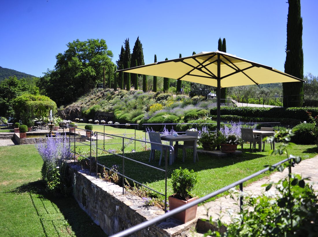
White, ivory, beige, écru, rope: these are the colours of absolute stillness, the essence of timeless luxury. Psychologically, they convey purity, calm and order.
From the outdoor colour psychology perspective, light neutrals amplify space visually and transmit a sense of freshness and mental ease. The filtered light they produce is soft, free of harsh shadows: the equivalent of a “beauty filter” applied to reality. It invites meditative rest and a suspension of ordinary time.
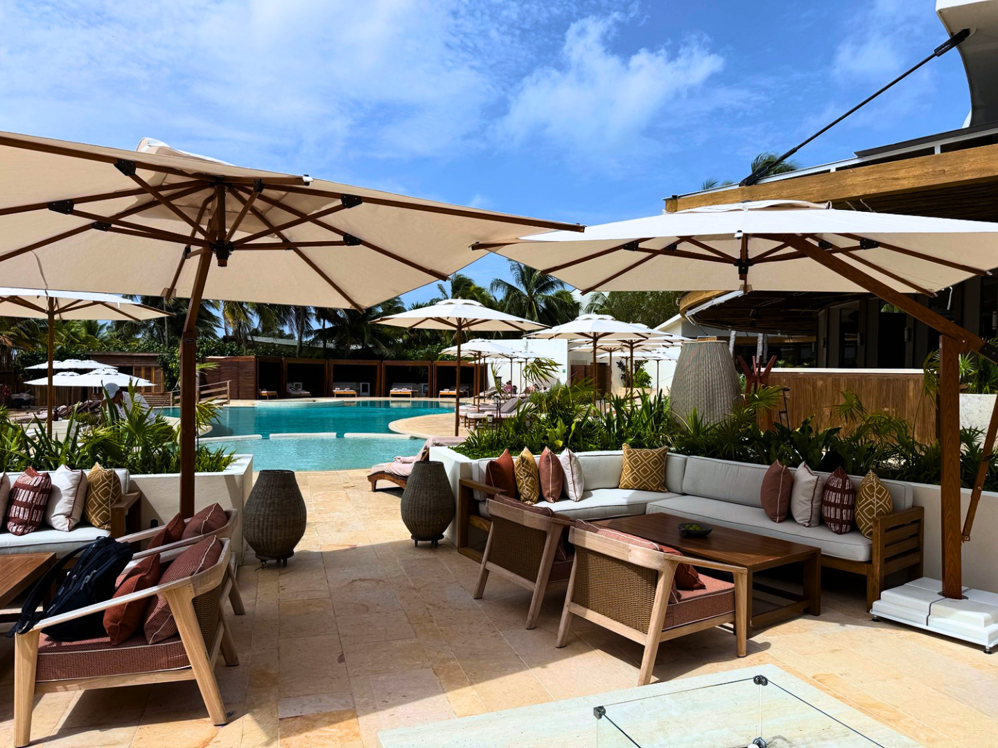
There is also a technical detail rarely brought into product storytelling, yet worth highlighting. Light filtered through a white or ivory fabric does not alter the natural colours of skin or food. For high-end outdoor dining, this is not an aesthetic consideration, but an essential condition.
Research into colour in interior environments indicates that warm, light tones can increase the perception of a welcoming space by as much as 20%. Outdoors, where space is already open, the effect translates into a sense of serene expansion. The surrounding landscape becomes the true protagonist; the fabric retreats into visual silence.
Botanical tones: biophilic design in sage green
Sage green, forest green, olive, moss: this chromatic family brings the principle of biophilic design into the luxury outdoor space. This is the now well-established architectural approach of integrating nature into built environments.
Green reduces stress levels and slows the heart rate. The study by Lee and colleagues (2015), widely cited in environmental psychology literature, demonstrates that simple visual exposure to a green setting increases concentration and produces a general sense of wellbeing. Applied to an outdoor context, this means that a sage green parasol does not merely complete the aesthetic of a garden. It actively creates a state of lower psychophysiological tension in those who rest beneath it.
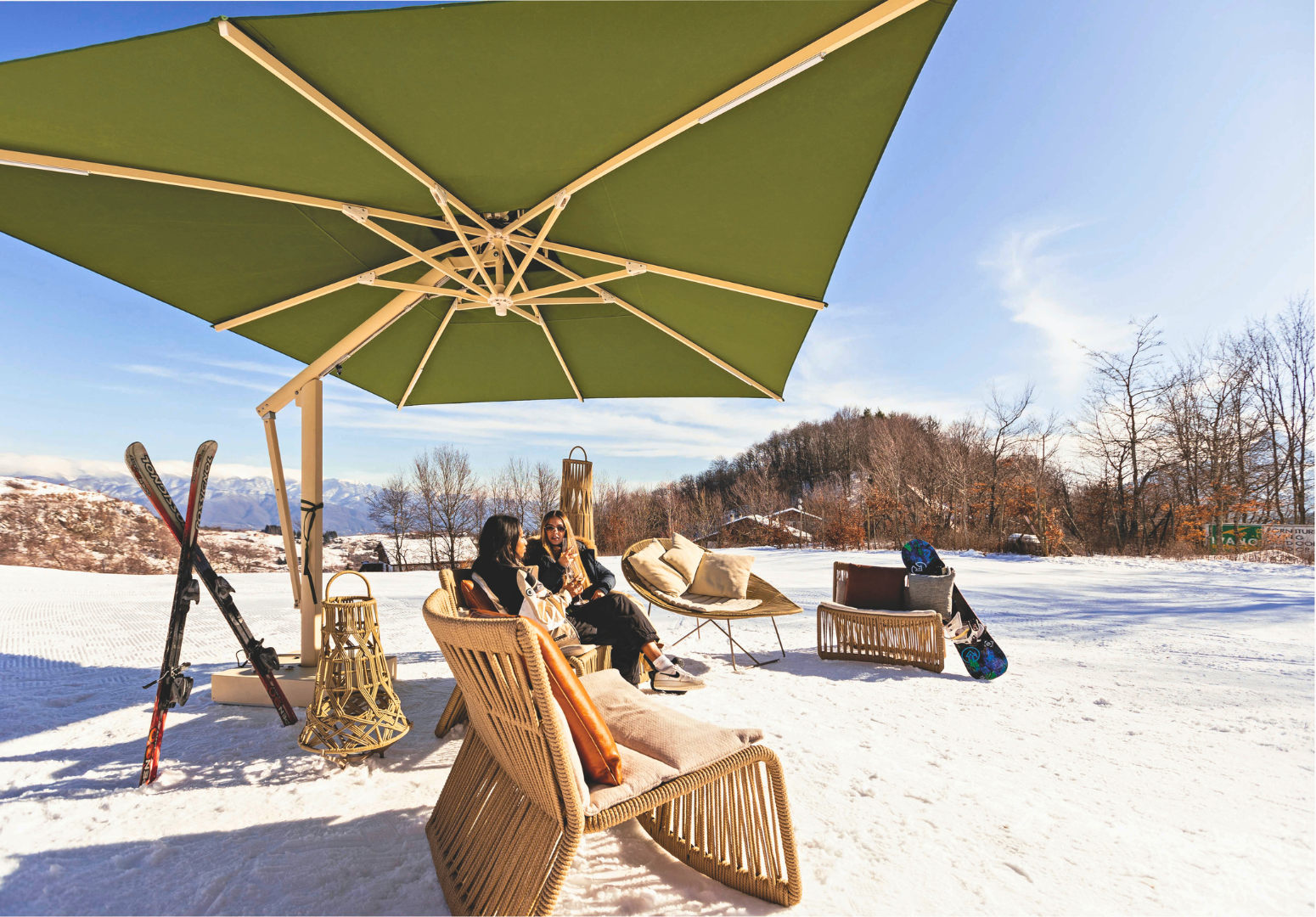
The light filtered through green evokes a precise sensation: that of sitting beneath the canopy of a tree, in a woodland that shelters without enclosing. It is one of the oldest and most reassuring sensory experiences for the human nervous system. Lighter greens produce a fresh, vitalising light close to the feeling of spring. Deeper greens move towards the intimacy of the understorey, more private, more sheltered, well suited to lounge areas calling for discretion and visual protection.
In contemporary hospitality projects, green finds its natural place in spa areas, poolside relaxation zones and spaces designed for reading or quiet contemplation. It is the outdoor colour that does not compete with the landscape. It extends it.
Earthy tones: the identitary warmth of terracotta and clay
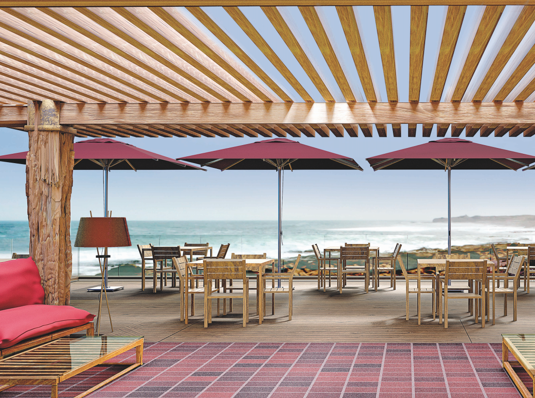
Terracotta, dove grey, burnt sand, brick red, clay: these colours speak of a specific geography. Of Mediterranean landscapes, limestone walls, terracotta rooftops, Tuscan countryside and the Versilian coastline.
Colour psychology places them among tones that convey security, human warmth and a sense of authentic hospitality. Terracotta and warm clay hues belong to the earthy family. Colours that characteristically blend into their surroundings, creating a fluid transition between built space and natural landscape.
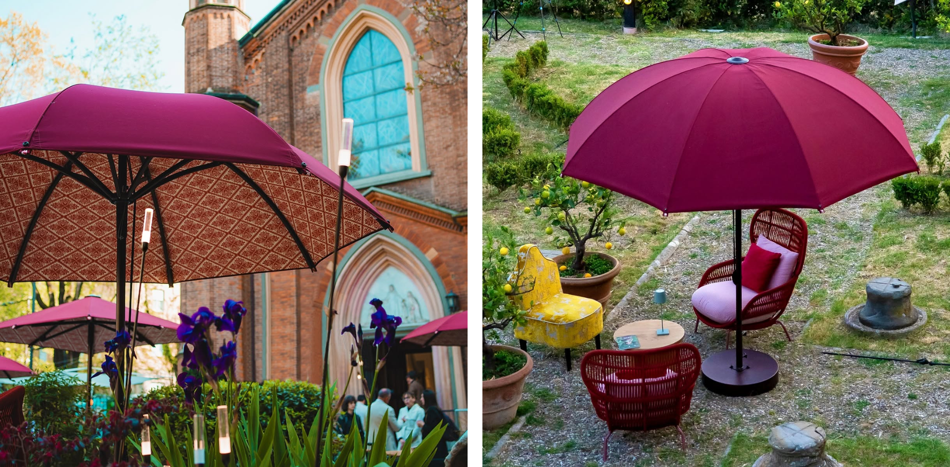
Visually, these fabrics pair beautifully with any natural material: teak, lava stone, porcelain stoneware, rattan. The overall effect is that of a space that appears to emerge organically from the ground, rather than having been placed upon it.
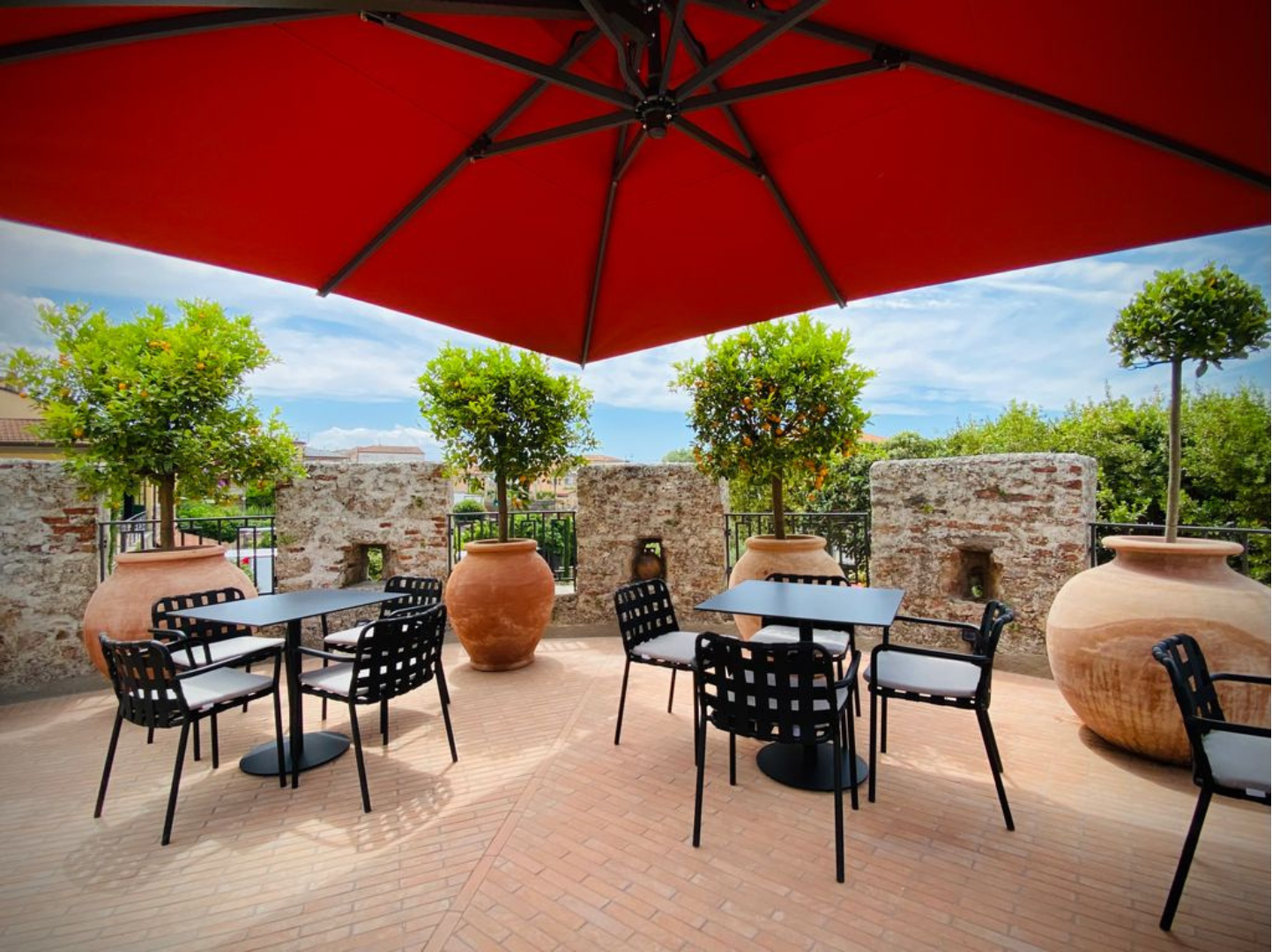
In luxury contexts, these tones build a narrative of organic, domestic refinement. They are the colours of lunch on a Tuscan terrace, breakfast in the cloister of a design masseria, aperitivo in a private garden overlooking the sea. Warm, grounded, authentic.
Marine tones: the Blue Mind Effect of blue and turquoise
Blue is the colour that scientific research most consistently associates with stress reduction. Documented physiological studies (AL-Ayash et al., 2016) confirm that light in blue wavelengths produces measurable reductions in heart rate and blood pressure. It is the mechanism behind the sudden sense of peace that comes from looking at the sea or a clear sky.
In luxury outdoor settings, blue in its deeper registers (navy, ocean) is the colour of the poolside, the yacht club, the beach resort. The light filtered through a deep blue fabric creates what environmental psychology describes as a “dense” shade: not heavy, but enveloping, almost nocturnal, capable of transmitting a perceived coolness even at midday.
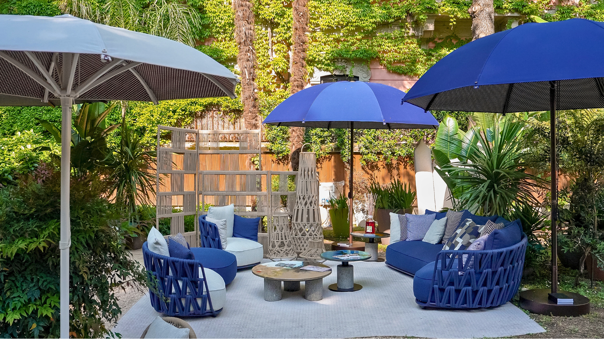
The Blue Mind concept, developed by marine neuroscientist Wallace J. Nichols in his research on the cognitive and emotional effects of water, describes a state of active calm, fluid thinking and reduced anxiety that proximity to water produces in the human brain. A deep blue parasol prolongs and amplifies that effect: even when the sea is out of sight, the filtered light evokes it.
Lighter variations (powder blue, sky blue, turquoise) shift the mood towards lightness and freshness, approaching the luminous neutrals while retaining the characteristic calming quality of blue. These are the tones of the Mediterranean resort, the table set for lunch beside the pool, the holiday atmosphere sought even within a private residence.
Deep tones: the total privacy of anthracite and black
There is a widespread misconception in outdoor design: that black and deep grey are uncomfortable choices, prone to attracting heat and visually oppressing a space. It is worth dispelling this with precision.
Fabric quality changes the equation entirely. A high-performance technical fabric does not behave like any ordinary dark surface. The result is a black or anthracite that protects, offering UV shielding that in many certified fabrics proves superior to lighter tones.
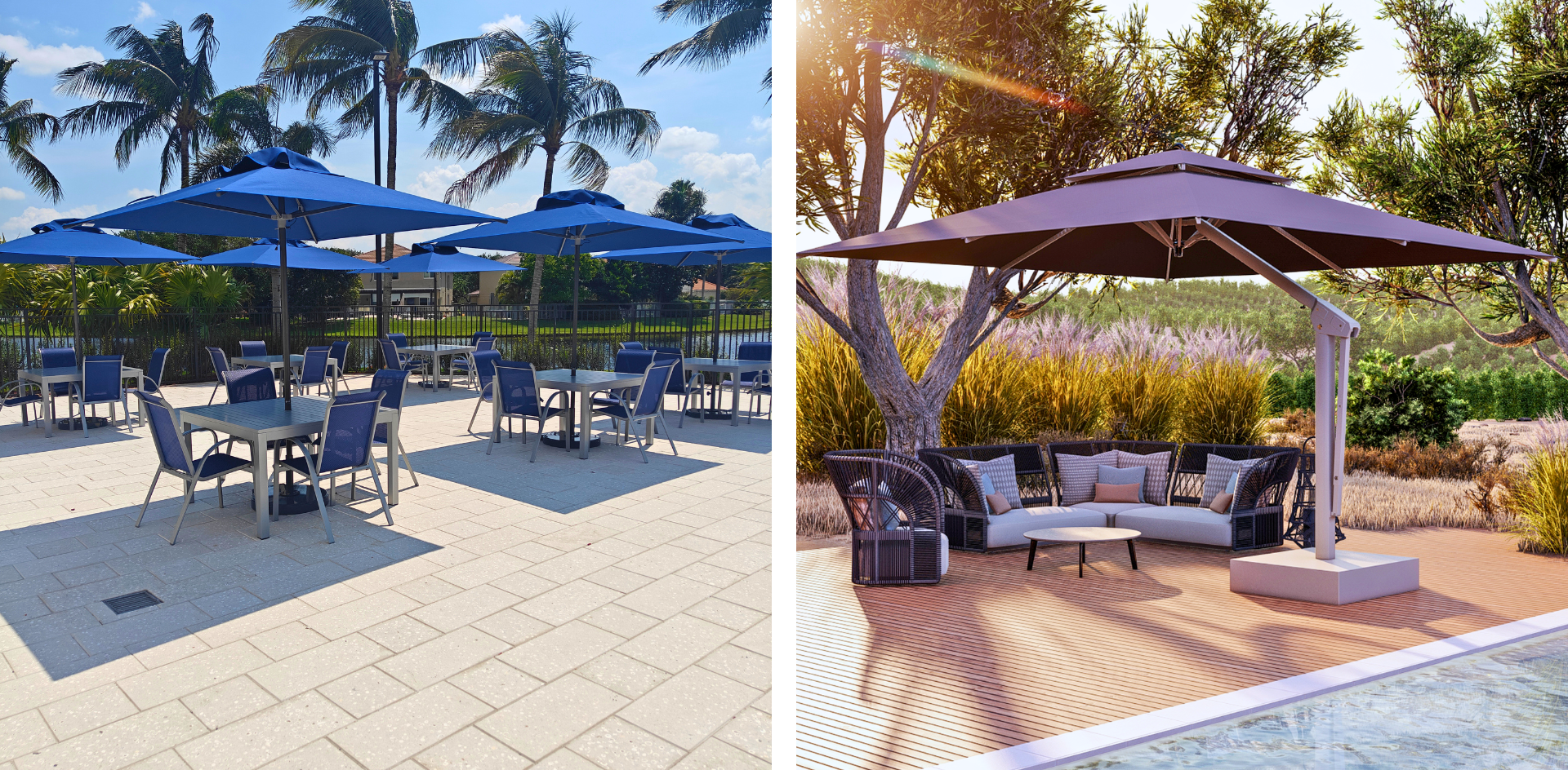
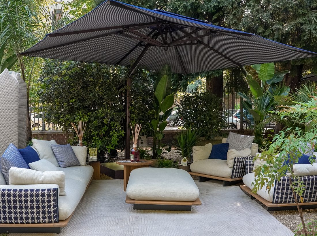
Perceptually and psychologically, deep tones produce a dense, defined shade. Navy and anthracite evoke stability, nobility and urban sophistication. They generate a “cocoon” effect that shields the gaze from the outside world, providing impeccable visual privacy. A quality highly sought in private villas, boutique hotel terraces and VIP beach club areas.
A further aesthetic advantage is the ability of black and anthracite to intensify the colours of the surrounding landscape by contrast. A flowering garden, a sea panorama, a pool with green tiles: everything gains saturation and vividness when framed against a dark ground.
Chromatic shade in hospitality: designing by zone and by guest
In hospitality design, the choice of parasol colour is a decision in experiential architecture, not merely aesthetics.
The colour must answer three questions: who is the guest? What are they doing in this space? What mental state do we want them to reach?
In multifunctional outdoor spaces, colour becomes a zoning system without physical barriers:
- Lounge areas intended for individual rest and discreet conversation benefit from cool, enveloping tones (green, navy, anthracite) that lower the psychophysiological rhythm and invite extended stays.
- Open-air dining areas, where conviviality is the central value, respond better to warm neutrals and earthy tones that do not alter the perception of food and sustain an atmosphere of human warmth.
- Poolside areas find their balance in blues and turquoises, which amplify the sense of freshness already evoked by the water.
Overly sharp chromatic contrasts risk making a space visually unstable over time; soft, progressive transitions create depth and continuity instead. This principle is particularly important in large hospitality settings, where colour and natural light work together to define the perceptual experience of every corner.
Luxury hospitality umbrellas: designing the shade to elevate the guest experience
In the luxury sector, chromatic coherence is a structural condition. A parasol is chosen in relation to the landscape, the flooring materials, the colour of the pool water, the surrounding planting, and the quality of light during peak hours of use.
Designing with colour means understanding that natural light shifts throughout the day and with it, the perception of the fabric changes too.
Those who design high-level outdoor spaces understand that the choice of fabric, its colour, texture and technical specification, is one of the most meaning-laden decisions in the entire project. It is not a question of choosing what to see. It is a question of choosing how to make people feel.
Designing shade is designing an emotion
Outdoor colour psychology reveals a truth that great spatial designers have always understood: shade is not an absence. It is an environment, the space where the architecture of sunlight and the architecture of fabric meet, and from their interaction something emerges that is neither light nor dark, but something far more valuable: atmosphere.
Choosing the colour of a luxury parasol fabric means choosing what kind of experience will be lived in the space that parasol governs. Every tone tells a different story. Every filtered light produces a different mood.
The colour of shade is the design of the invisible. And it may well be the detail that distinguishes a truly great outdoor space from one that is merely beautiful.
Choosing the right fabric colour is never a decision made in isolation. At Poggesi, every project begins with a consultation that takes into account the landscape, the context of use and the identity of the space.